TYPOGRAPHY HIERARCHY PROJECT
Client:
SCAD
Year:
2025
Project Type:
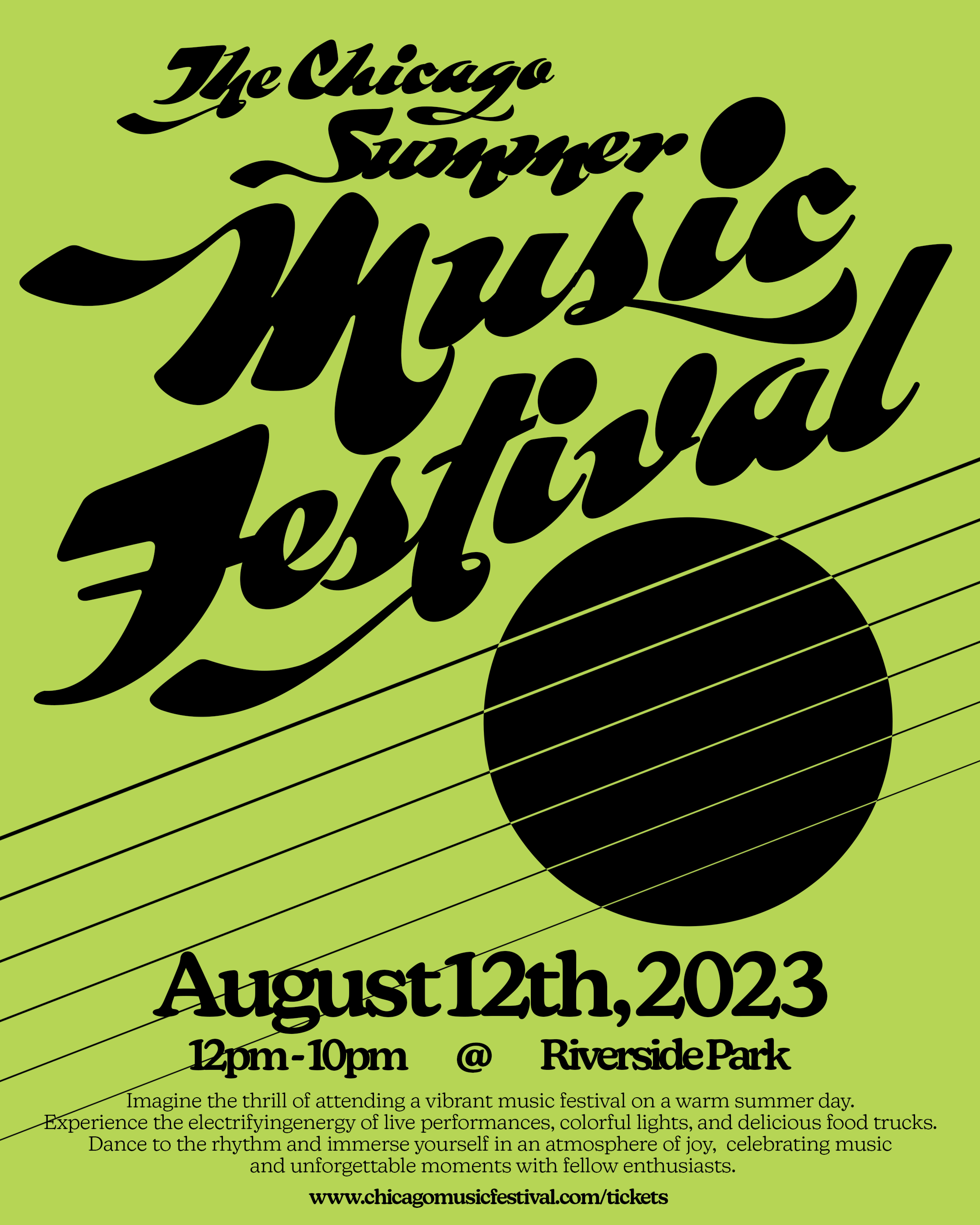
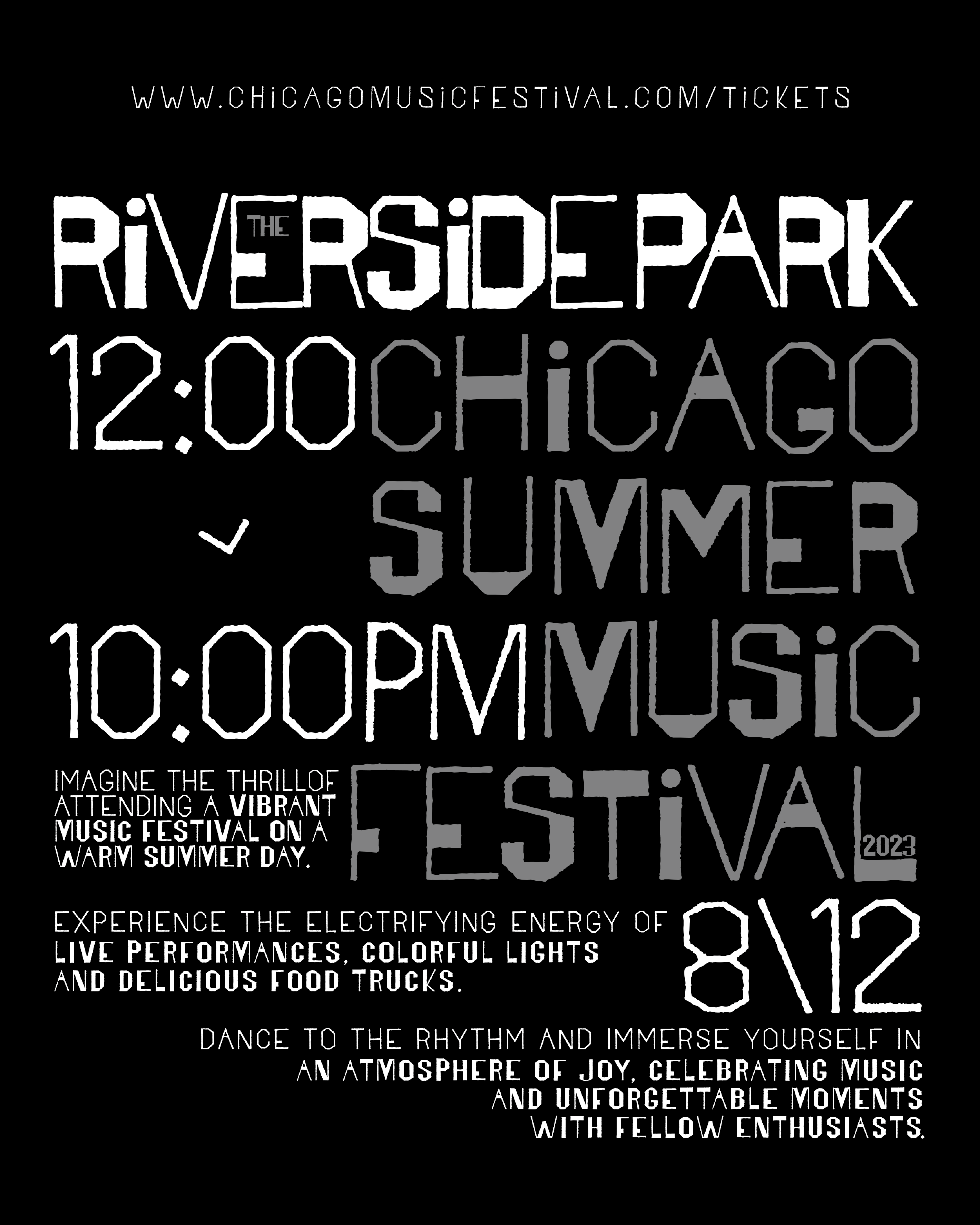
This project was completed as an assignment for one of my typography courses at The Savannah College of Art and Design. It is a series of three posters meant to advertise for the same event brief; each of which were given their own specific design restrictions in terms of typeface/font selection, typeface/font sizes, colors, shapes/lines, images/illustrations (see process book for more details on this). The goal was to work around these design limitations while maintaining a clear hierarchical order of information disclosed on each poster. This project showcased my ability to design and use typography creatively under harsh limitations and establish hierarchy/readability in print design.
Print Design
Process Book ------>